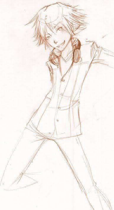
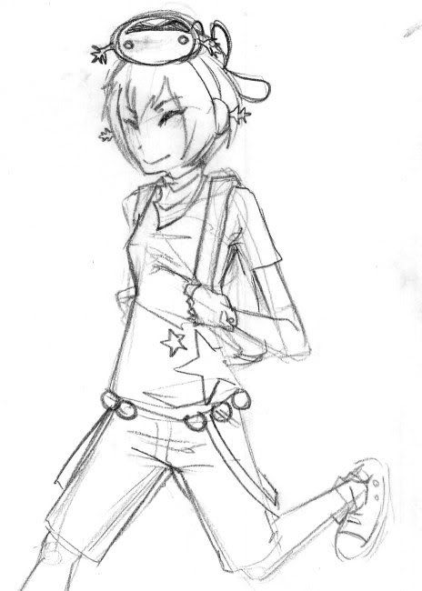
Clearly I was watching my daily raocow fix while drawing that. :'D
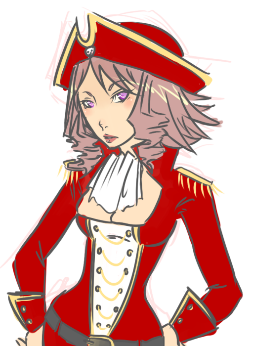
I agree that the red is overpowering. I always try to experiment with my coloured pieces, since I havent really developed a style I am comfortable with, but I think the combination of ~trying something new~ [the lighter lineart] along with ~follow the swatches~ [colours from my original concept] didnt work out to good. pfft.
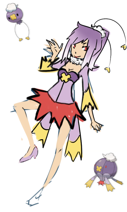
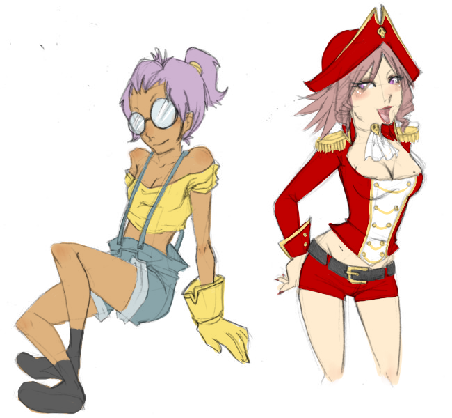
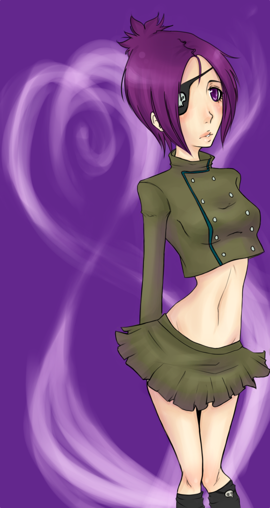
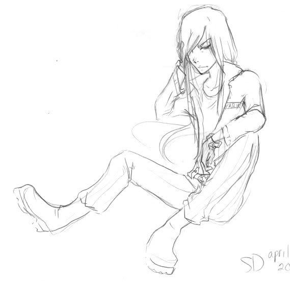
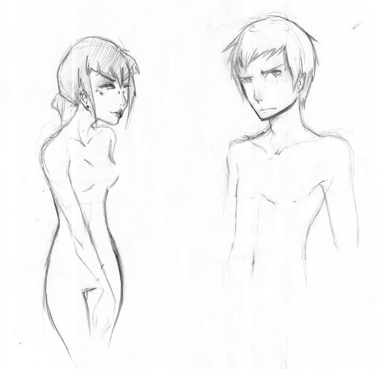
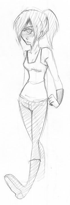
Also, there's no way I could honestly give her those ridiculous antigravity watermelon boobs. rofl.
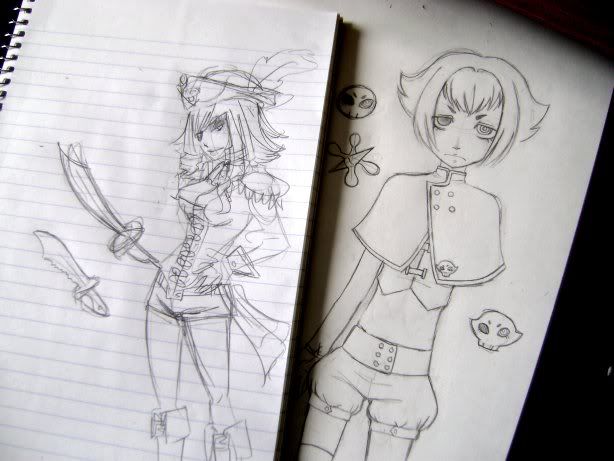
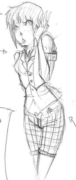
RE: her collar, I gave up trying to make it look right when I realized I had been drawing it wrong the entire time. FFT. it's supposed to be a huge folded down collar. my bad.
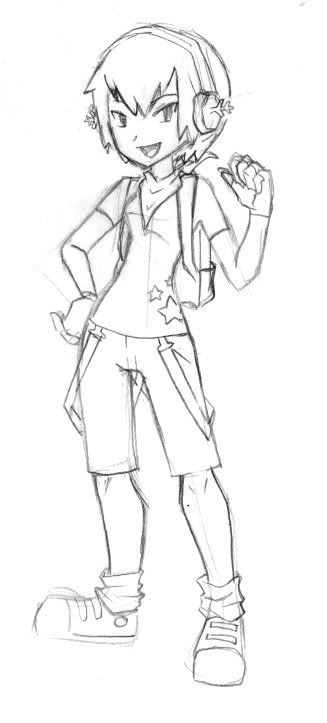
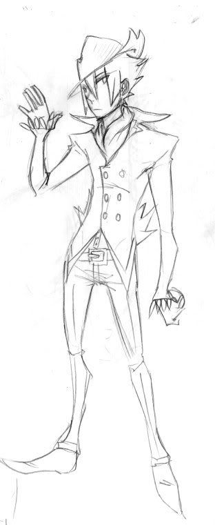
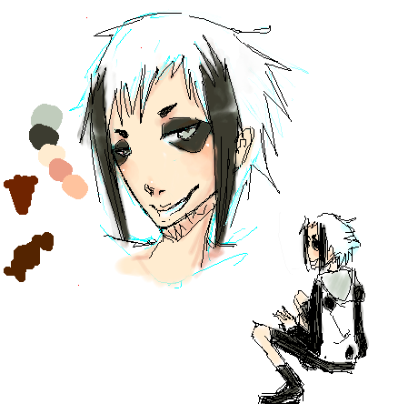
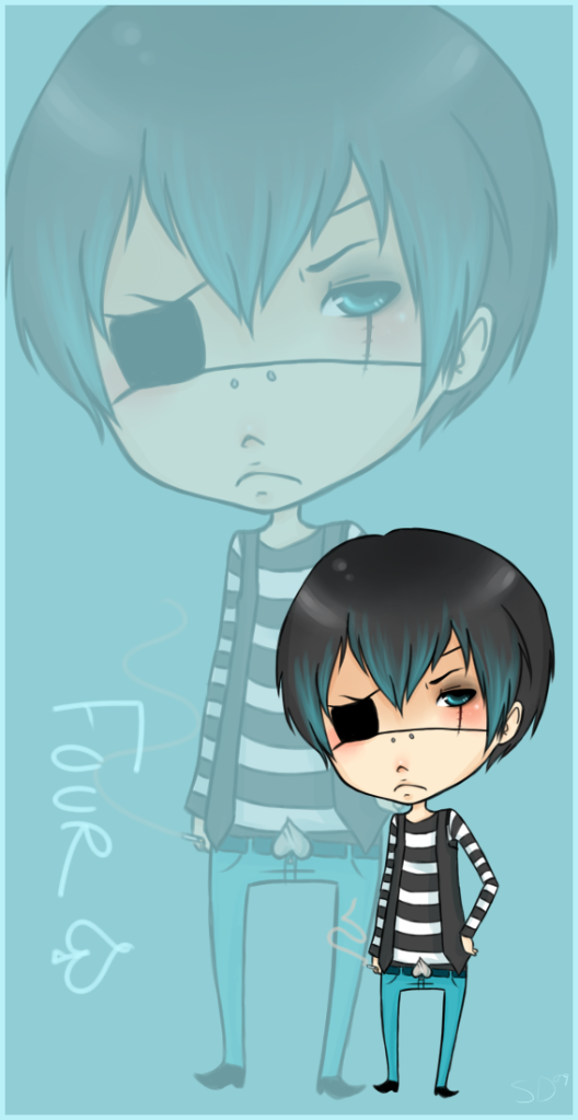
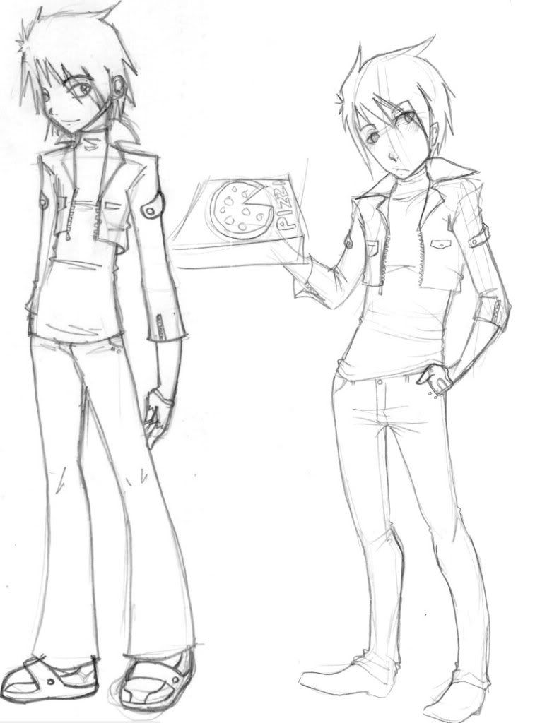
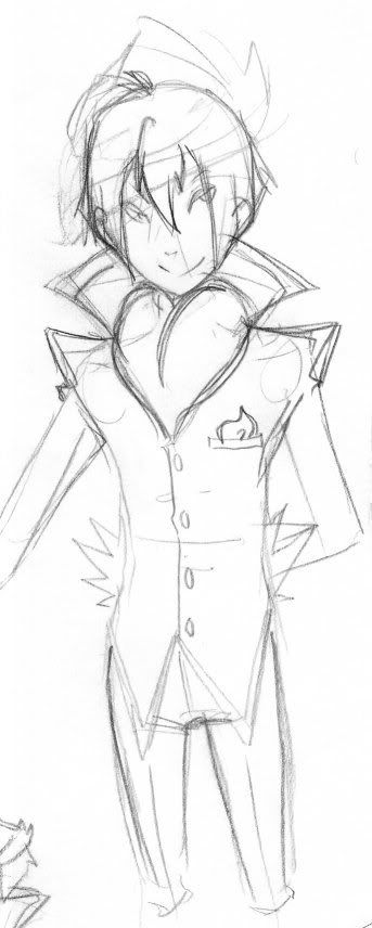
Blueguy [Who I will refer to as Four from now on] in the second picture is.. pretty much just supposed to be super deformed. Chibi. Whatever you'd like to call it. Haha. The two dots on his face are a bridge piercing.
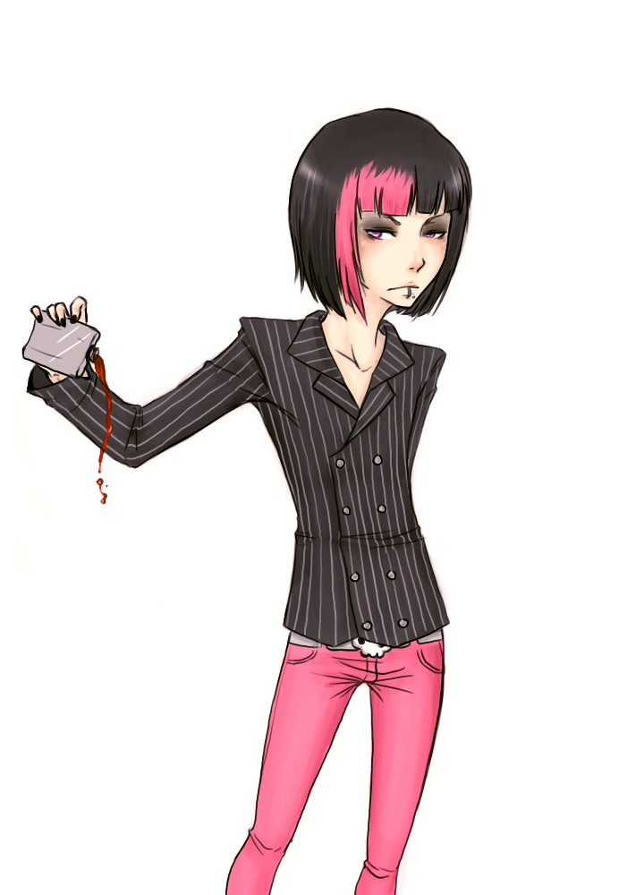
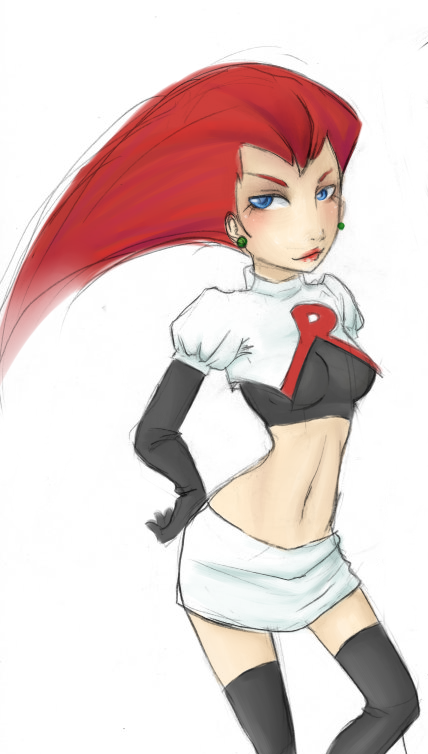
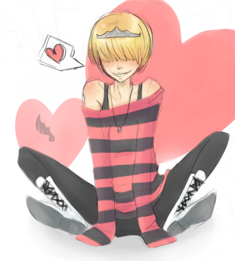
Jessie, I dont even want to comment on. Ahahaa. She was intended to come out a lot more stylized and action posey like an older drawing I've done. the body, sans the arms, IMO is good enough for me, but her head ended up wicked huge and her hand ended up super tiny. But I threw her in there anyway for ~diversity~.
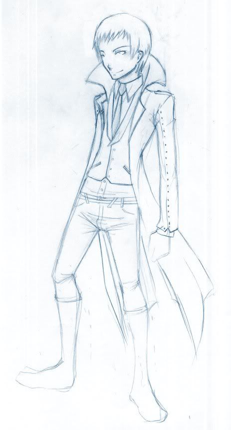
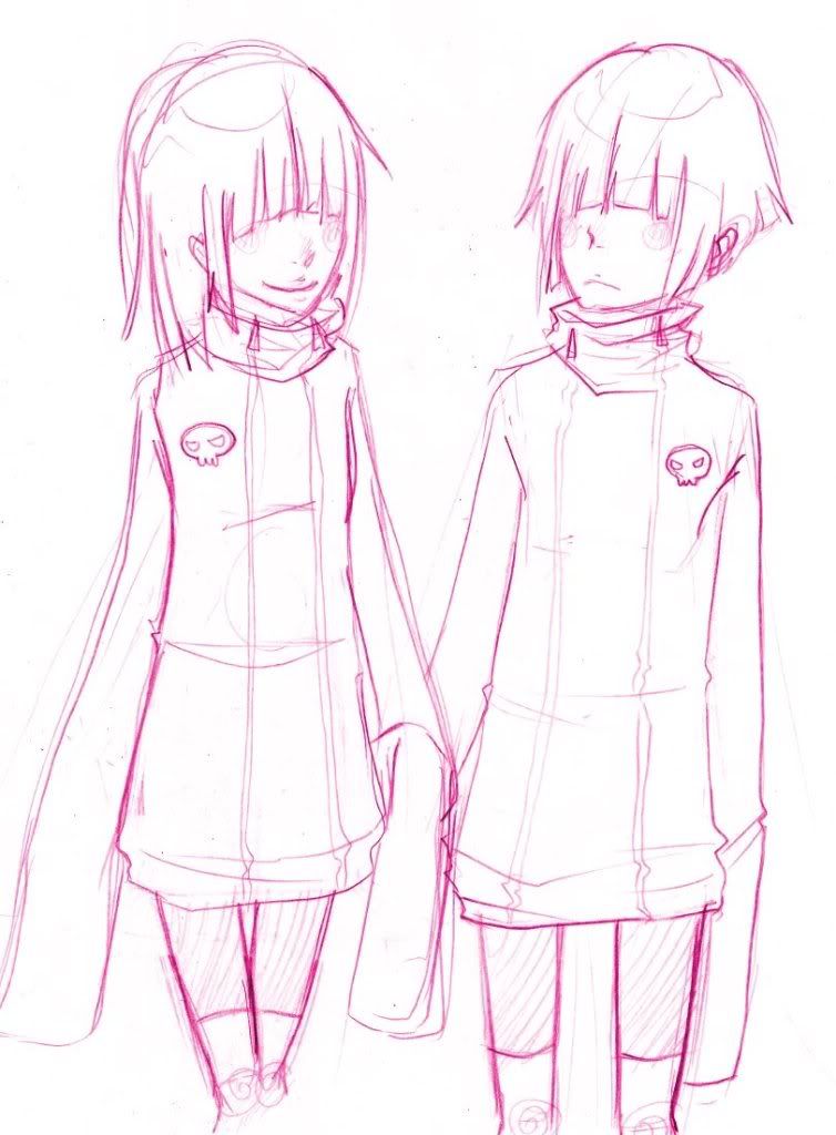
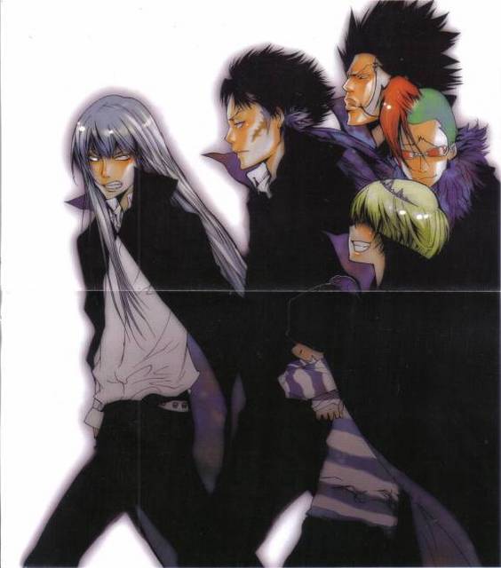
The three other fanarts are all dudes, btw. The first two being Squalo and Belphegor respectively from 'Katekyo Hitman Reborn!'. [
http://img1.ak.crunchyroll.com/i/spire3 ... 0_full.jpg the silver haired guy and the blonde kid.]
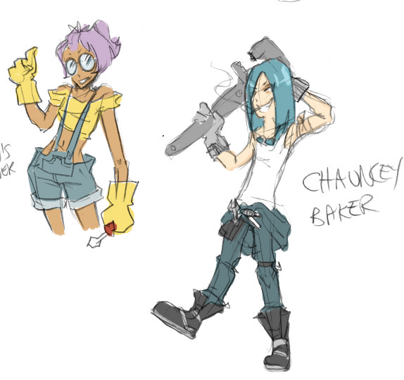
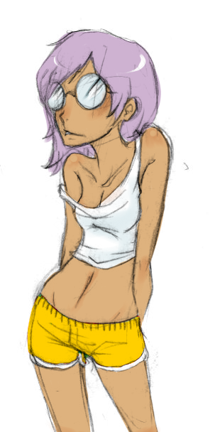
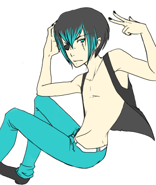
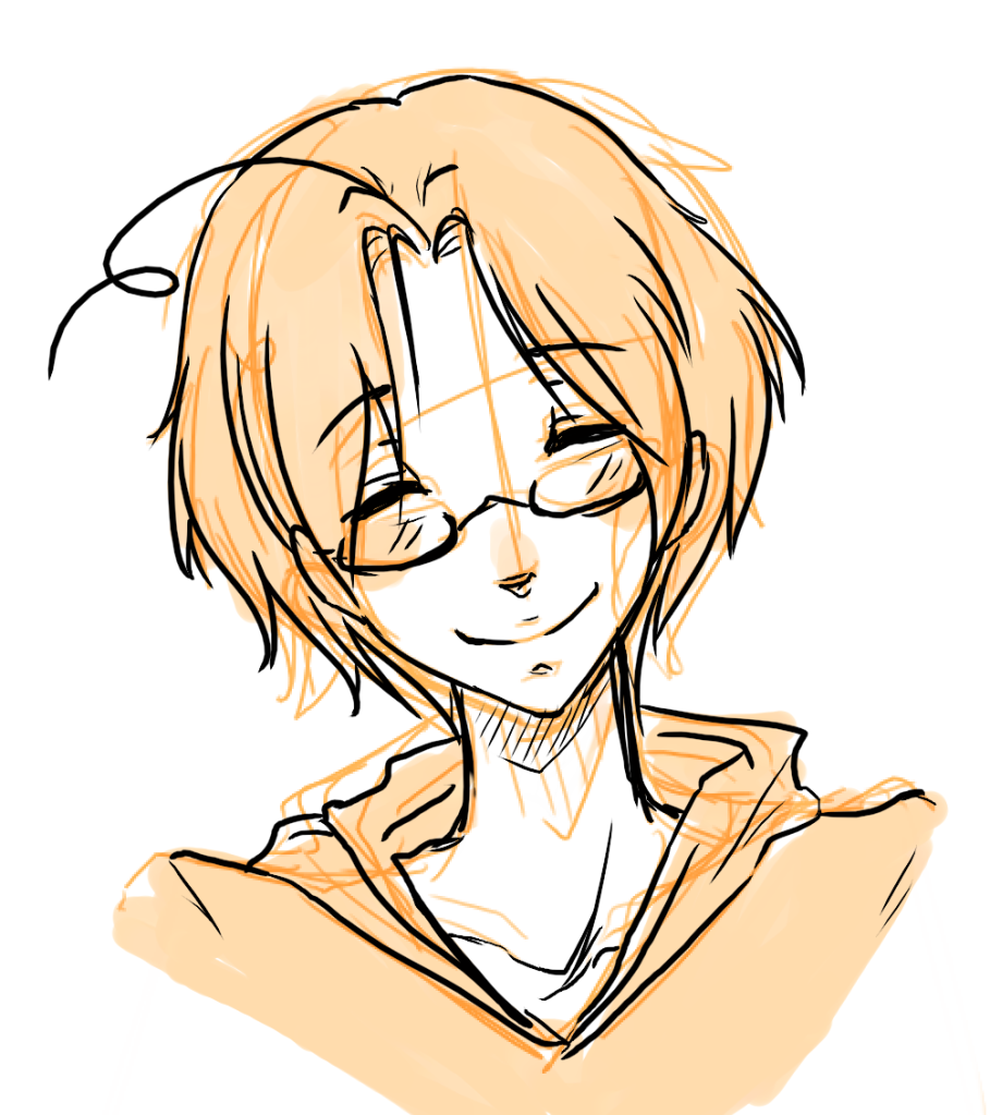
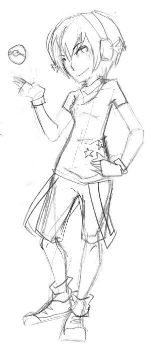
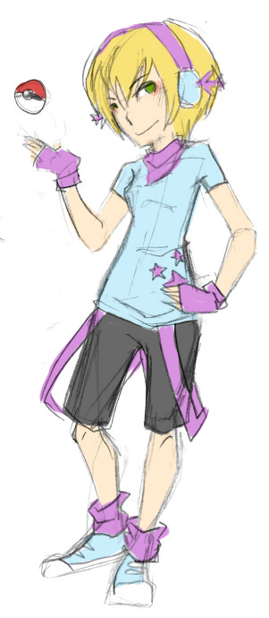
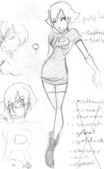
typically when Im colouring sketches, like the one of pinkybowlcutkid, I dont really bother fixing up my lines or smoothing out all my colouring.
the last one being Canada from Hetalia. My guilty pleasure. Also the first time I have been terrified of my own Fandom.
Thankyou again for such indepth feedback :C <3


